menu-work
 |
 |
 |
 |
 |
 |
 |
 |
 |
 |
 |
 |
 |
 |
 |
 |
 |
 |
 |
 |
 |
 |
 |
 |
 |
 |
| Unframed
Print |
| Mounted
& Matted |
|
8"
x 10" |
$ 175.00. |
| 11"
x 14" |
$ 275.00. |
| 16"
x 20" |
$ 450.00. |
| Sizes
are print size, |
| mounting
is larger. |
| Purchasing
Details |
|
| Framed
Print |
| Mounted
& Matted |
| W
/ Aluminum Frame |
|
8"
x 10" |
$ 250.00. |
| 11"
x 14" |
$ 375.00. |
| 16"
x 20" |
$ 600.00. |
| Sizes
are print size, |
| mounting
is larger. |
| Purchasing
Details |
|
| ©
1989-2021. |
| Tranquility
Images |
| All
rights reserved. |
|
 |
|
|
This
page will assist you in the calibration of your monitors Contrast &
Brightness &
Brightness settings.
By performing the procedures below the photographs presented within this
web site will be seen as they are intended. Without your monitor
properly calibrated (or adjusted) the photographs may appear too light
or too dark and will be lacking the true contrast that was intended to
be represented. settings.
By performing the procedures below the photographs presented within this
web site will be seen as they are intended. Without your monitor
properly calibrated (or adjusted) the photographs may appear too light
or too dark and will be lacking the true contrast that was intended to
be represented. |
| Your
monitor should be well warmed up for this calibration to be effective.
At least 15 minutes of on time prior to calibration, preferably 1 hour.
Please
read all the way through this page and check the grayscale charts against
the descriptive text to determine optimum settings for your monitor. |
| Color
Management: To calibrate my monitor
I used Colorvision's Spyder2PRO
and its calibration software, with a color temperature setting of 6500K
and gamma of 2.2. |
| Monitor
Adjustment: It is important to have
your monitor adjusted properly in order to view my photographs or, for
that matter, any web site which displays images for which an effort is
made to control color in a consistent, industry standard manner.
(Yes, we realize that color management is still, in many ways, an elusive
thing.) This means setting your monitor, either with its built-in
on-screen controls or through software, so that the grays are rendered
without any color cast and so that you can discern detail in shadows (at
the darkest parts of the charts below) and in highlights (at the brightest
parts of the charts below). My primary intention here is to make
sure that you have the Contrastand
Brightnessset
correctly. To try and get the Red, Green and Blue settings correct
are another story and is not going to be addressed here. |
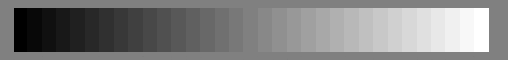 |
| The
grayscale chart above shows gradations of neutral gray from pure black
to pure white. You should be able to discern differences in each
gradation of gray, with the possible
exception of the two or three darkest levels.
There should be no color cast to any of the levels. This chart is
created by changing the RGB colors in lockstep by increments of 8, e.g.,
(0,0,0), (8,8,8), (16,16,16), ..., (255, 255, 255). Or you can do
it by incrementing the HSB values by about 3 each step, e.g. (0,0,0), (0,0,3),
(0,0,6), ..., (0,0,100).
You
might want to start off this calibration procedure by reseting your monitors
settings to the Factory Presets.
Next
adjust your
Contrastsetting
as high as it will go without blowing out the whites at the far right side
of the grayscale chart. You may want to set it to a low setting first
to see how it interacts with the scale above. With your adjustment
you should just barely be able to see an ever so slight difference between
the very right most gradation (pure white) and the adjacent gradation to
the left. You will notice that it just barely starts to appear as
an ever so slight shade of gray.
Next,
adjust your Brightnesssetting
until you can just discern differences between the blacks at the far left
with the possible exception of the two or three darkest gratation levels
as mentioned above. You do not want to set your brightness too high
because then you will not have any true pure black visible in any of the
images presented within the web site.
You
may find that you may have to go back and make small adjustments to the
contrast and brightness to fine tune the calibration. |
 |
| The
grayscale chart above, similar to the top one, shows all 256 levels of
neutral gray in a horizontal sweep. Each gradation is a single pixel wide.
This chart is not really of any significant use in helping you adjust your
monitor, but it does represent the full scale from pure black to pure white. |
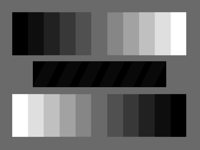 |
| The
above chart shows gradations of gray from 0% (pure black) through 10, 20,
30, 40, 60, 70, 80 and 90% to 100% (pure white). The surrounding
area is 50% gray. The black bar
in the center has diagonal stripes of 7% gray -- can you discern them from
the pure black in which they are set?
Try reducing the Brightnesssetting
of your monitor so that the diagonal stripes just blend with the black,
then raise the brightness one notch -- all while maintaining the integrity
of the pure white.
The
above 11 gradations can be related to the Zone Systems pure black (Zone
0) being at one end, middle gray (Zone V) in the middle and pure white
(Zone X) at the opposite end. |
 |
 |
 |
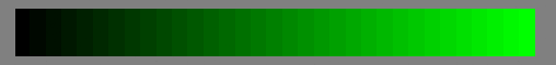
| The
above color charts are similar to the grayscale chart at the top, which
showed even gradations of neutral gray from darkest (black) to lightest
(white). These show even gradations of pure red, green and blue. You should
be able to discern each gradation at the bright end. Ideally, you should
also discern each at the dark end, but the darkest several levels of any
one color may blend together. |
|